The Programme Grid Mistake: When Too Many Choices Hide the Shape of a Day
A clear festival programme grid helps readers spot the experience they want, compare sessions and choose confidently without scanning a wall of listings.
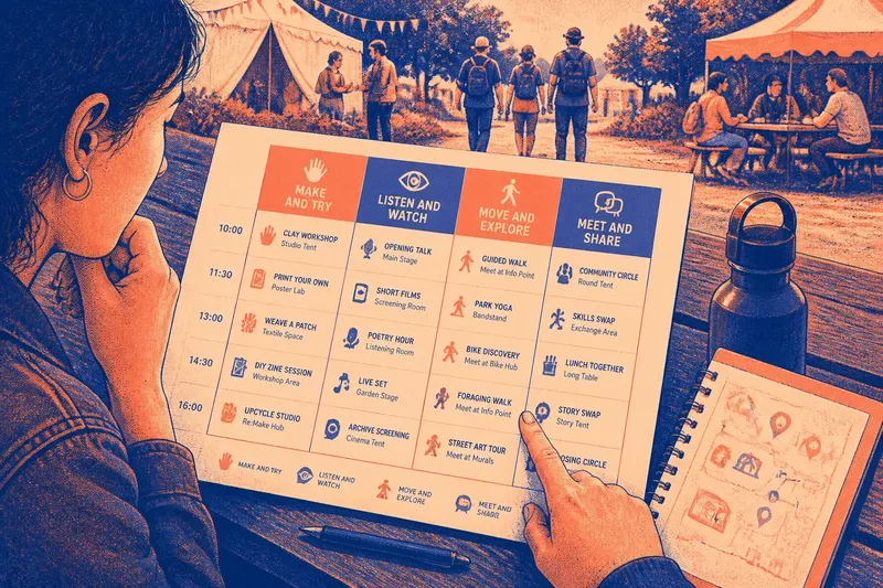
The common programme grid mistake is giving every event the same visual weight. A reader sees a wall of names, times and rooms, but cannot tell whether the day is built around making, listening, watching or joining in. A clear festival programme grid shows those kinds of experience before the reader has to compare individual listings.
Start with the reader’s question
People rarely arrive at a programme asking only, “What starts next?” They may want a lively shared activity, a quiet place to listen, a performance suitable for children, or a chance to learn a practical skill. If the page shows only titles and start times, readers must infer the character of each event from words that may be unfamiliar.
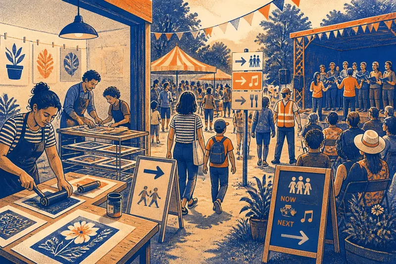
Group the programme around the experience people are choosing, not around the team that produced it. “Hands-on making” is more useful to a visitor than an internal label such as “Community Partnerships”. The organiser’s department matters behind the scenes; the visitor needs to know what they can do.
Write down the main kinds of participation before laying out the page. Keep the categories distinct enough to guide a choice, but broad enough that each one can hold several events.
Give categories useful names
Good labels describe what happens. “Listen and watch” signals a mostly seated experience; “Make and try” promises active participation; “Meet and share” suggests conversation or communal activity. These labels can sit above a schedule, appear as filters on a website, or work as colour-coded markers in a printed leaflet.
Choose names that make sense without insider knowledge. A phrase such as “Cross-sector exchange” may be accurate to the organisers, but it does not tell a visitor whether to expect a talk, workshop or informal discussion. If an event could fit two categories, decide which description best helps someone choose, then use a secondary tag for the other quality.
For a small programme, three or four clear groups are often easier to scan than a long taxonomy. Add another only when it represents a genuinely different kind of experience, not merely a different team or venue.
Keep the grid readable
A grid is good at showing when and where. It is less good at explaining what an event feels like. If every cell contains a title, room, host, age note, access detail and description, the useful differences disappear in visual noise.
Use the grid for the facts readers need to compare quickly: event name, time, venue and a short indication of participation. Put longer descriptions in a linked programme entry or a separate page. In print, a clear symbol and a small legend can carry a category; on a screen, text labels should remain visible so meaning does not depend on colour alone.
Make the hierarchy deliberate. A session title should be easy to find, while logistical details should remain legible but secondary. Avoid shrinking the type to squeeze every description into a single view; a page that technically contains everything can still be hard to use.
Use more than one route
Categories should help readers find an experience, not force them into a single way of browsing. Keep a chronological schedule available for people who already know a time or performer. A category view can offer another route, grouping events by participation type while retaining the time and venue beside each entry.
Where a digital programme offers filters, make the controls easy to clear and show which filters are active. A visitor who chooses “Make and try” should be able to see that choice, remove it, or add another. In a printed programme, a contents panel with category names and page references can serve a similar purpose.
Imagine a festival listing a clay workshop, a short film screening and a guided neighbourhood walk. If all three appear only in one dense timetable, a visitor seeking an active outing may overlook the walk. Grouping it under “Move and explore”, while preserving its start time and meeting point, gives that reader a faster route to a suitable choice.
Check the categories?
How many programme categories should there be?
Use enough to distinguish the main kinds of experience, but not so many that a reader must learn a new vocabulary for every event. If two labels repeatedly lead to the same choices, combine them or clarify the difference.
Should events appear in more than one group?
Use a primary category and, where useful, a secondary tag. This preserves a clear structure while recognising that a workshop may also be family-friendly or outdoors.
Does colour alone work as a category label?
No: colour can speed recognition, but it should accompany a written label or a clear symbol. That helps readers using monochrome print, colour-contrast settings or a screen reader interpret the same information.
What belongs in the grid itself?
Keep the event title, timing, location and a concise cue about the activity close together. Put fuller descriptions elsewhere, and make the route to them obvious in both print and digital formats.
Review the page in use
Before publication, look at the programme as a visitor would: first at a glance, then while trying to find a particular kind of activity. Can someone distinguish a performance from a participatory session without reading every description? Can they locate the venue and time after finding an event by category?
Ask a colleague who did not build the programme to find one example of each experience type. Watch where they pause, misread a label or return to the schedule. Treat that hesitation as a sign to revise the wording or layout, not as a failure by the reader.
Keep the category system consistent across the website, printed programme and venue signage where practical. A visitor who recognises “Make and try” on the page should not have to decode a different phrase at the information point. A well-shaped festival programme grid makes the day’s character visible while leaving readers free to choose their own route through it.